
System Blue Logo Evolution
Image 1. This is System Blue‘s original logo. It lacks spark or anything that sets it apart from anything else… its static. System Blue and the Blue Devils Drum and Bugle Corps are first class, dynamic and truly remarkable organizations forging new and exciting directions in marching band education, development and execution. They needed a mark that truly reflected their System of Excellence. The mark also needed to be flexible for use across many mediums… from a small metal deboss on a tuba, to an ink imprint on a drumstick, to a hoody screen print all the way up to a giant stadium banner. It had to scream excellence in all these realms. We used the word “remarkable” as a benchmark.
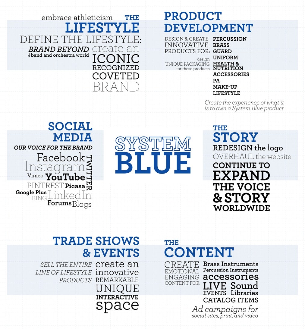
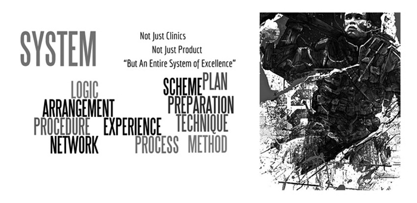
Image 2. The logo redesign was just a part of the overall brand and marketing strategy for System Blue. This graphic shows all the areas where the brand needed to shine brightly. The visual story is essential.
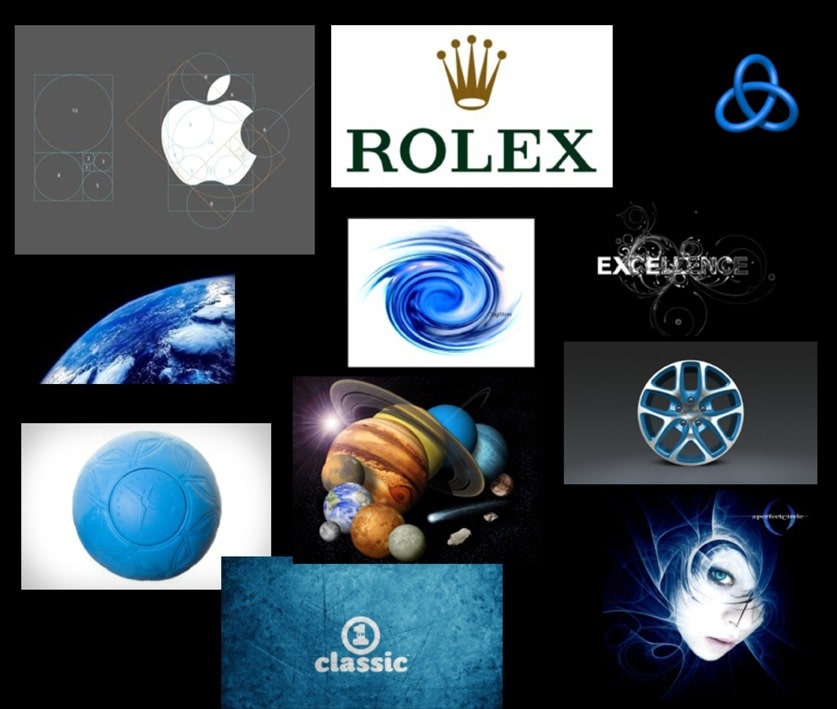
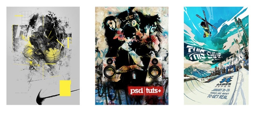
Image 3. We started with a very basic mood board that encompassed not only the visual style we were moving toward but also some benchmark brands that had the look and feel we hoped to achieve.
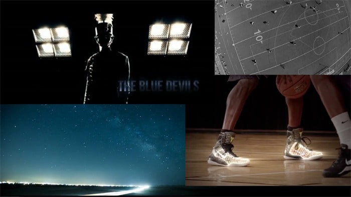
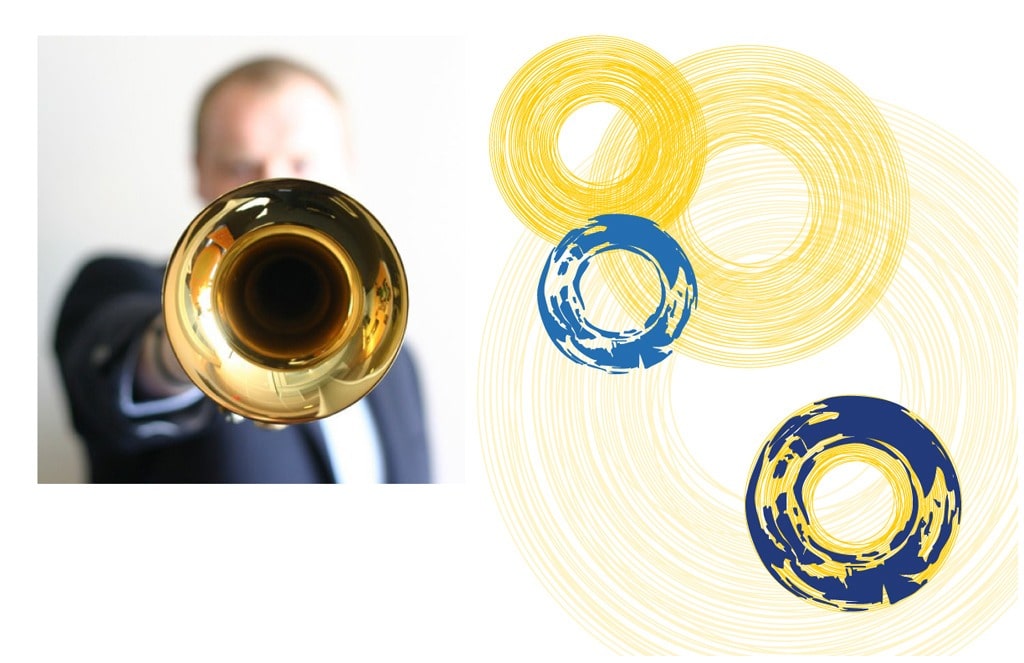
Image 4. We also captured some imagery we thought helped inform the direction of the logo. This kind of photography begs for a very clean and graphic accompaniment… this mark could not look homemade, hand-drawn or organic. It needed precision, clean lines and more of a technical/mechanical feel in order to coexist with this style of imagery.
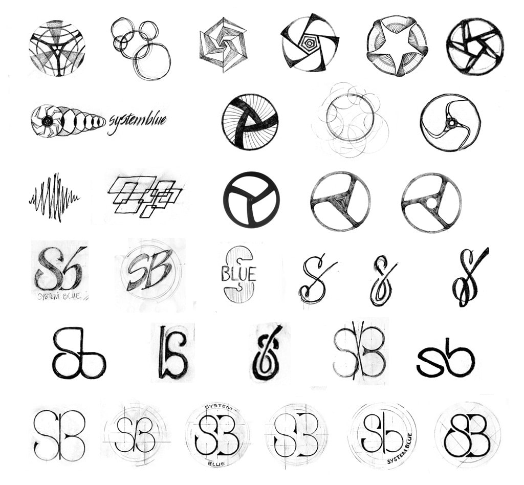
Image 5. Early sketches were all over the map… it’s much easier to evaluate if something works once it’s on the page so I just let my pencil and my brain explore before making any judgements about what’s developing. When we stepped back and looked at pages and pages of thumbnails, it became obvious what might work and what wasn’t even close.
Image 6. We pulled out the thumbnails that felt like they could benefit from further development. At this point, we weren’t sold on a typographic treatment of “SB”… System Blue is not Nike (yet) so we were fairly sure we needed the full name as part of the mark, not just SB. Still, we wanted to explore the possibilities.
Image 7. While sketch exploration continued, we continued searching for additional imagery, textures and styles that felt right for the way we envisioned the brand. We were fairly relentless about testing the sketches alongside this imagery.
Image 8. Further testing included the addition of typography. We wanted bold, classic, and the potential to be loud but also clean, crisp and dynamic with the ability to be subtle (lighter weights of type). It started to become apparent that our favorite sketch directions were too light and possibly too organic when placed next to the type we knew was working.
Image 9. It became especially obvious here that the light, thin lines of these sketches, even once we took them to the computer, would look weak and quiet within the typography and imagery we’d chosen for the brand. It’s never fun to arrive at this discovery but we had to go through the exercise to know it was the wrong direction.
Image 10. We then turned to the creator and producer of Inside BD360, Michael Zapanta for some further brand development. We really loved what Zap had been creating for the Blue Devils and thought that it exactly captured the vibe we were looking to create for System Blue.
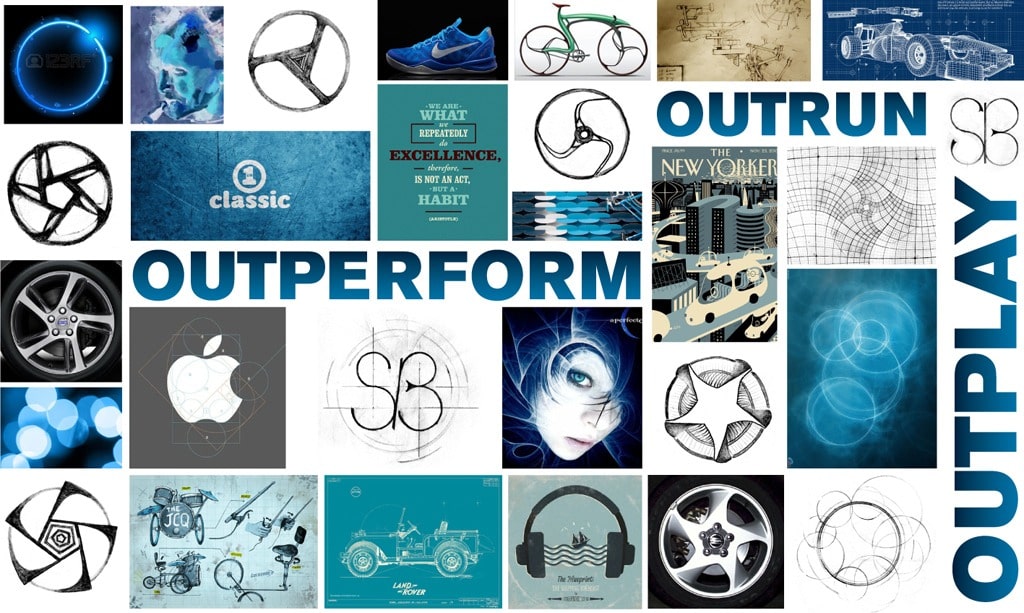
Image 11. Zap’s inspiration caused us to step things up even more, to go edgier, grittier, stronger, faster, higher… to ‘my better is better than your better’ levels (thank you, Nike). We needed this mark to be more loud and brassy, more Formula 1 meets Paris-Roubaix, more Rolex meets X-Games. More BRING IT.
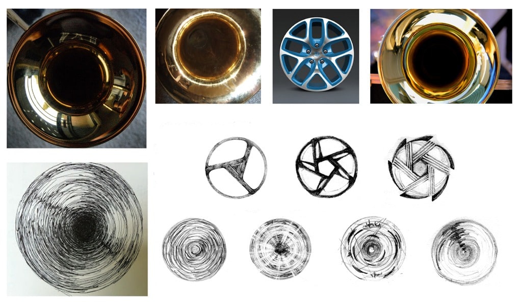
Image 12. We started looking at more horns, drums and any kind of gritty circular object. The light reflections in horn bells were definitely inspiring… but how could we translate that to any kind of graphic?
Image 13. Additional explorations continued… gritty worked well with a pencil but it remained unclear how this could work for a clean, mechanical vector image. Somehow we needed to capture the power and loudness of chaos (think violent thunderstorm) in a crisp image.
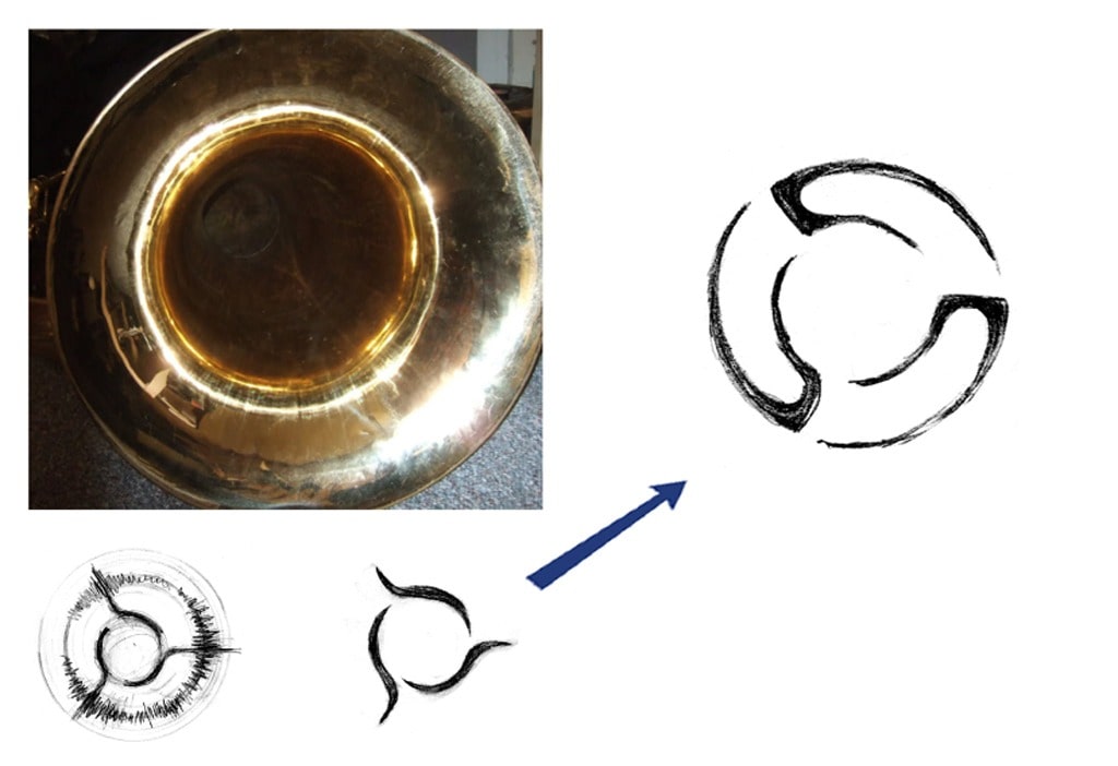
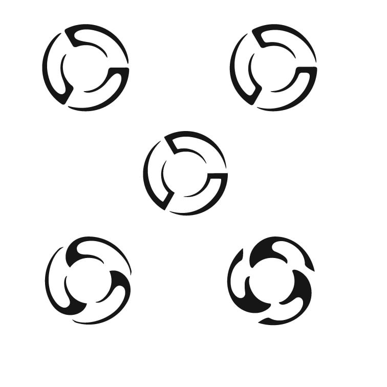
Image 14. And then somehow the answer appeared… somehow the marks on the page, inspired by the light on this bell, captured motion and created a spinning sensation while remaining still. It needed further testing but it immediately felt like the right solution to all of us.
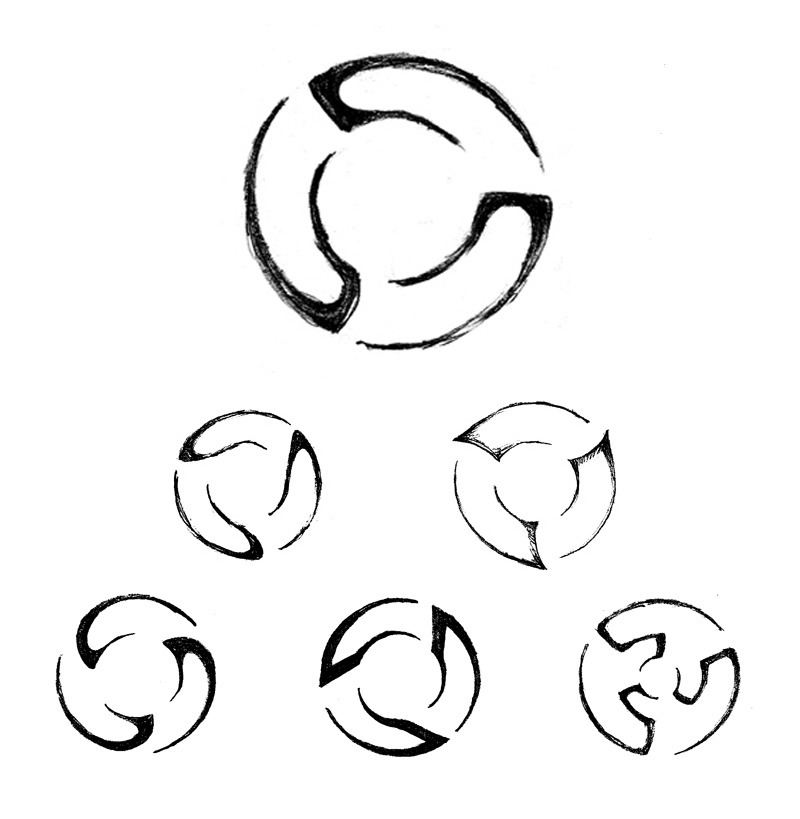
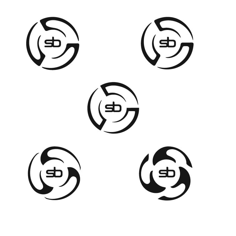
Image 15. Then the question became: Are there other shapes or configurations for this structure that will make it even MORE dynamic? What about corners? Edges? Should they be sharp? Rounded? Where should the breaks be? Will it spin? Is it truly round or somewhat oval (is brand recognition from the original oval logo important)? Will the parts always be part of the whole or will they ever break apart? What are the limits of the shapes? Everything needed exploration. These are just a few of the variations…
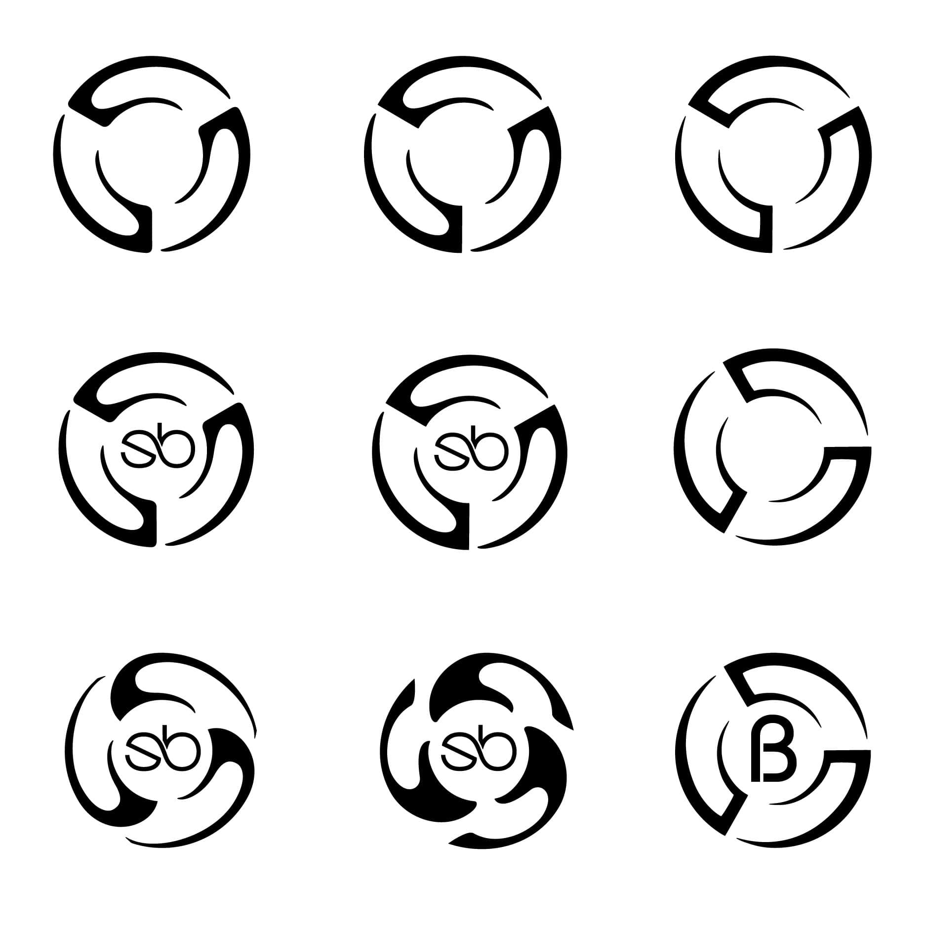
Image 16. It was time to move things to the computer. Illustrator allowed us to play more easily than sketching from here on out. This part of the process went on for another week or so… questions we addressed: rounded or sharp? empty interior or SB inside the mark? what’s the rotation configuration? could the circle be the ‘System’ and a B alone stand for ‘Blue’ (answer: no)? Is the weight right now in proportion to the imagery and typography?
Image 17. Answers to the previous questions helped us narrow things down to 5 options, with 3 top contenders and 2 possibles. It was time to move on to choosing the right logo typography.
Image 18. From about 3000 typeface families, we chose about 45 possibilities to consider. These were some of the 8-10 options we carefully tested to see how the mark would sit next to each one. We asked, does the type make the mark look diminutive? Overbearing? What size should the mark be relative to the type? What about its positioning? All caps? All lowercase? A combination? Will the ascenders and descenders cause issues later?
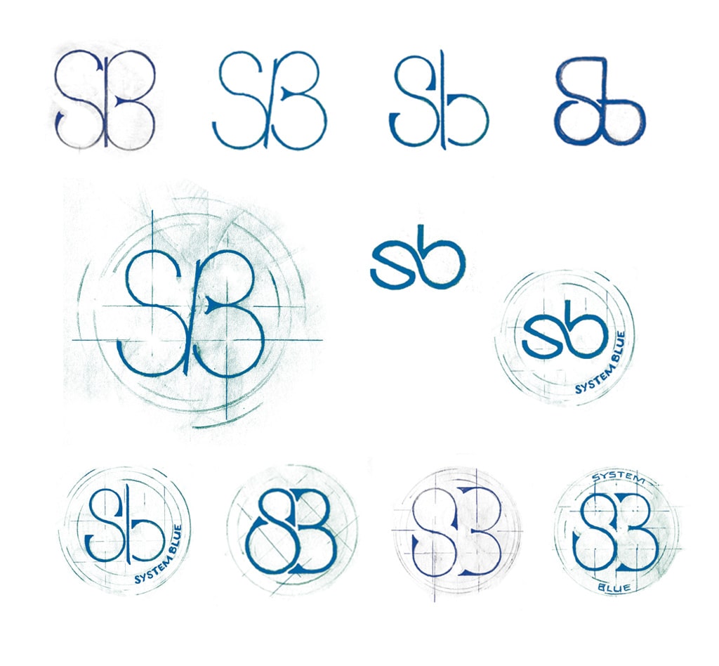
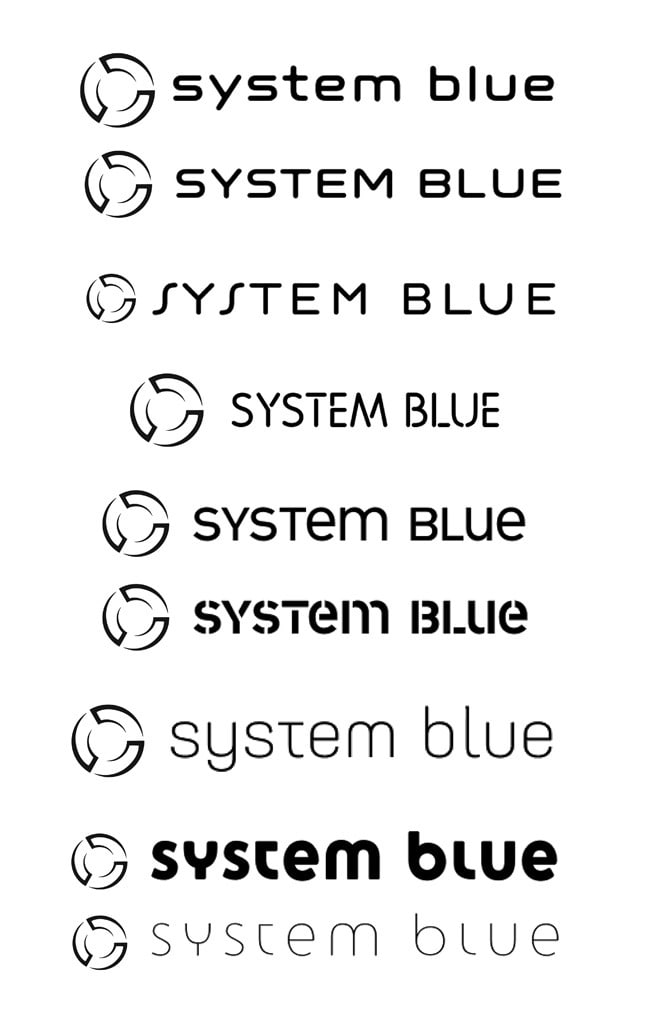
Image 19. We landed on a dynamic typeface that had both rounded and square terminal versions. Then the questions became all caps vs. lower case and how would we configure them? This is the rounded version, with lower case on the left and all caps on the right.
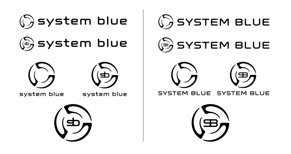
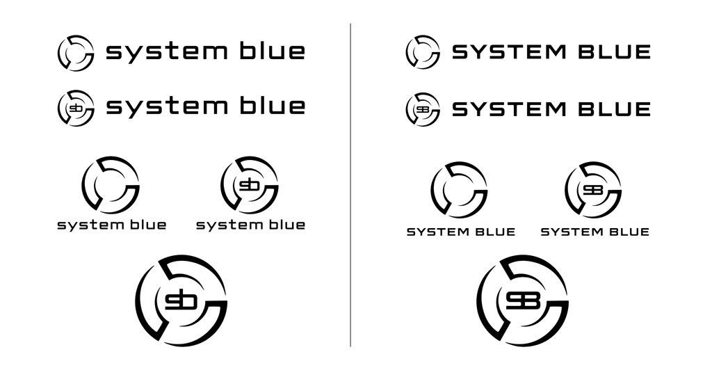
Image 20. Here’s the square terminal version, again with lower case on the left and all caps on the right. We were also looking carefully at how the SB might sit inside the mark. We were divided over whether it felt right or whether it felt like a mark inside a mark…and was it overkill to have ‘SB’ and ‘System Blue’ in the same configuration?
Image 21. We were pretty sure neither of these options was working (though Sea World might have been interested) but we had to test them to be sure. At this stage we felt pretty sure they weren’t in contention. And we were also all leaning toward lower case type, no caps.
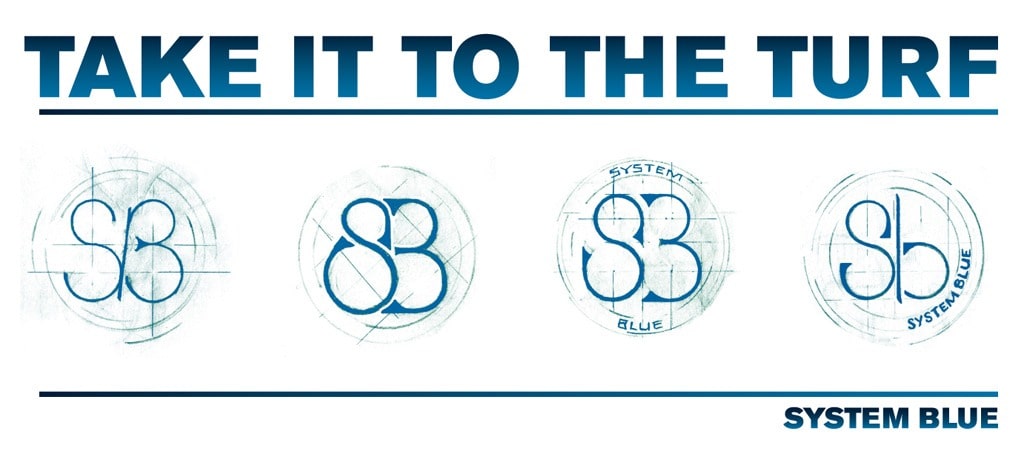
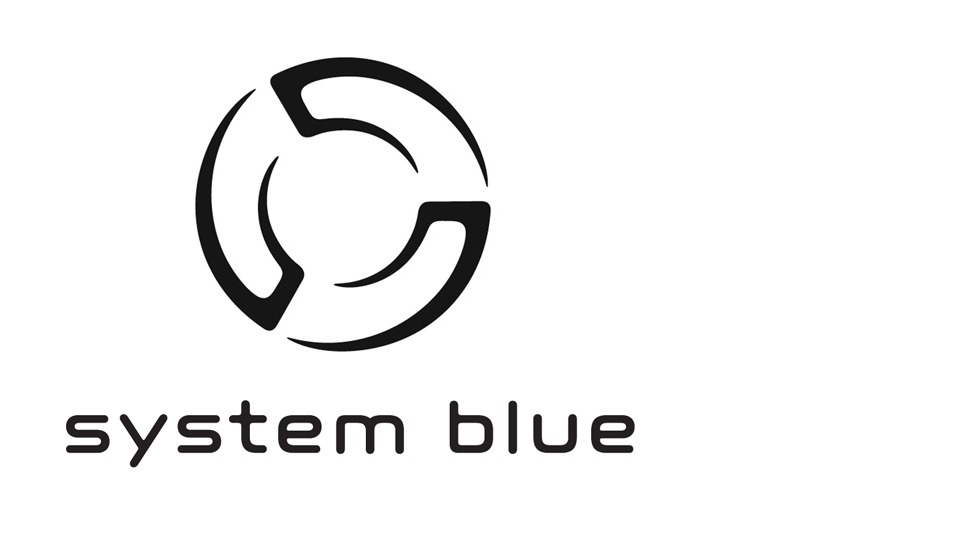
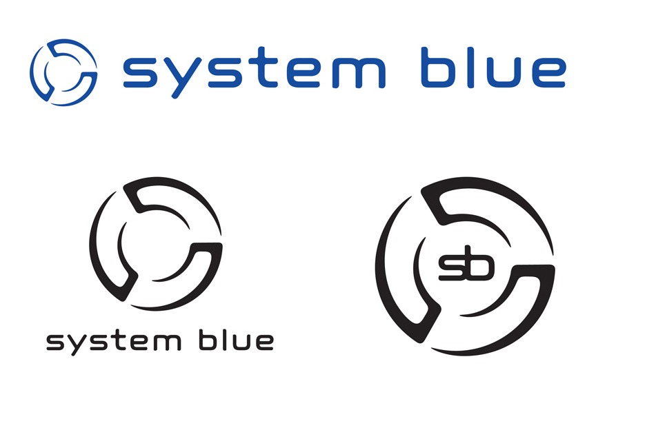
Image 22. After much discussion, we decided that we would use EITHER SB or System Blue with the circular mark but not both at the same time. Further to that, we decided that the mark should never appear without either the words ‘System Blue’ or the letters ‘sb’ until the System Blue brand becomes better recognized (think Nike Swoosh). This was a final look at the circular configuration with just the ‘sb.’ (Editor’s note: After only a few months, we began breaking our rules about letting the mark appear without the type… and after a year of solid use, the mark is now proudly standing on its own, recognized for what it symbolizes in the Marching world.)
Image 23. Finally we had our primary mark and typograhy. Time for final configurations and some geeky designer tweaks…
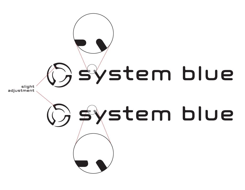
Image 24. It’s the little things that matter in the end so to make this mark truly our own, we made tiny adjustments to square off some of the rounded terminals in the logotype. Such a small thing seems kind of trivial but it gave the overall feel just a little bit of sharpness. We also flattened out the interior edges of the mark so that all the shapes were complementing one another.
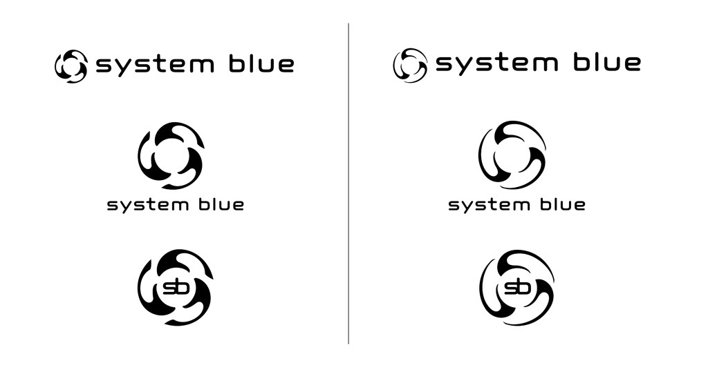
Image 25. Final three configurations that were initially implemented across the System Blue brand. We’ve also created a logo standards document outlining all the acceptable (and unacceptable) ways that vendors and partners can use this logo. Consistency is essential!
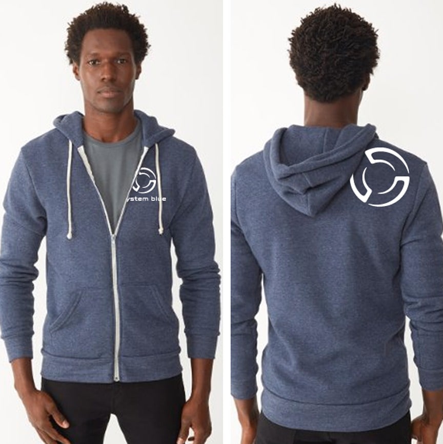
Image 26. Three separate configurations make this logo versatile for use in many different applications… it can be stamped on items as small as drum sticks or ear plugs or emblazoned on giant stadium banners.
Now that you’ve witnessed the evolution of the logo, check out the current brand identity and how we’re using it in our marketing strategy at System Blue.