Design School
I find it fascinating to look back on some of the first projects I worked on — to realize that the essence of my style existed even then but to also see how much my work has evolved. Here’s a little walk down memory lane…
PACKAGING
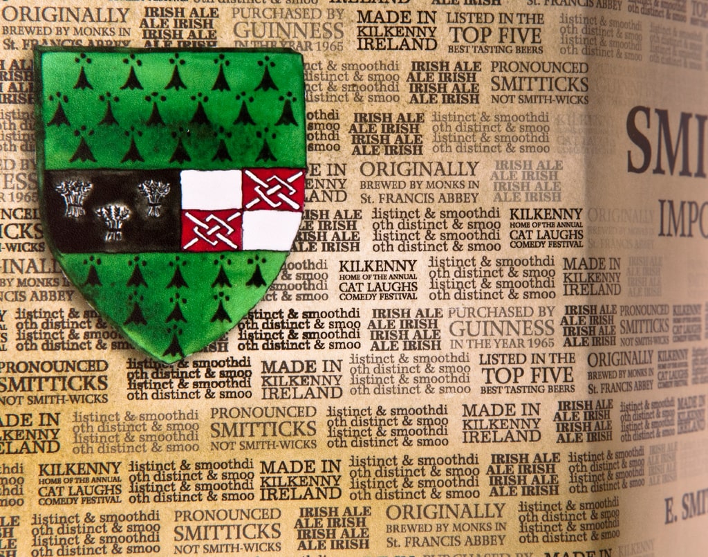
Smithwick’s Imported Irish Ale
Bricks of Kilkenny Castle are made from stacked type in this concept for a novelty beer six pack that offers fun-facts about the fine ale (including how to pronounce it properly), and the historic town in which it is brewed. Gouache illustrations of the Kilkenny, Ireland crest added some color and interest to the hexagonal design.
Conserves Ferrer
Packaging Concept to rebrand a line of sauces that were using Comic Sans as their main typeface on store shelves.
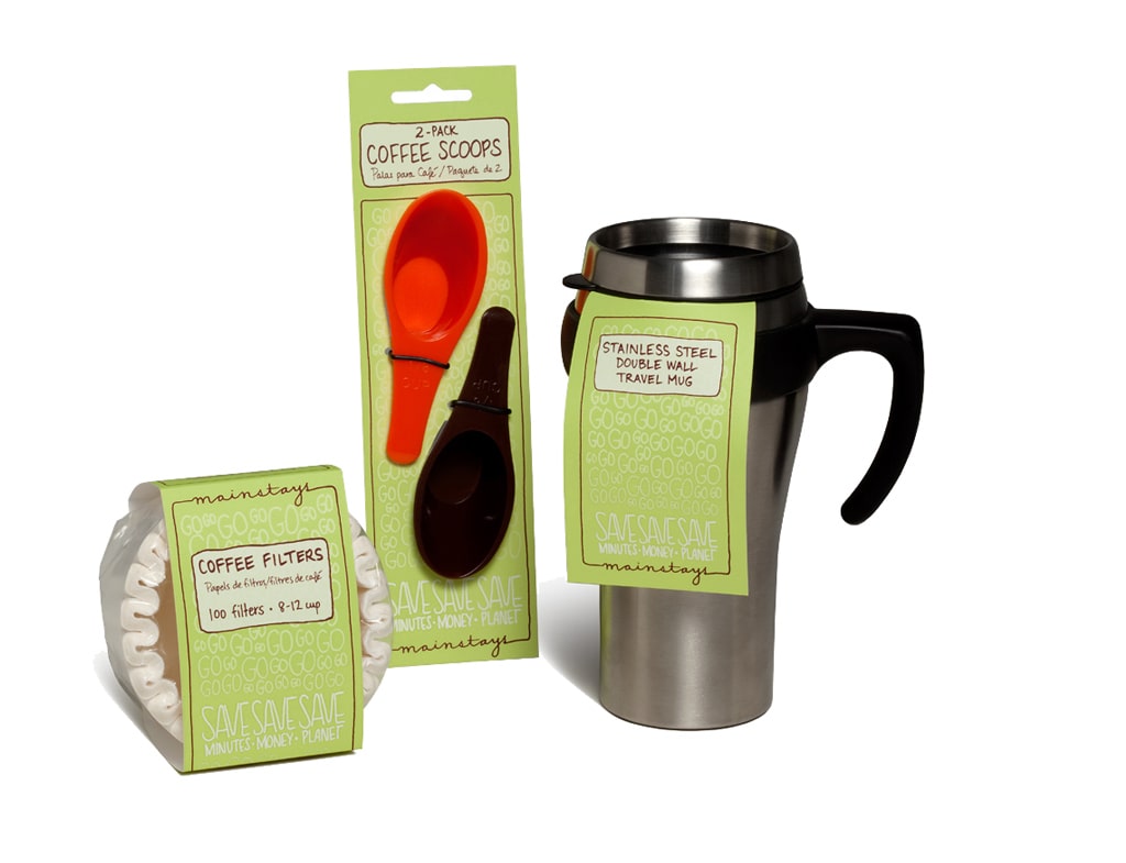
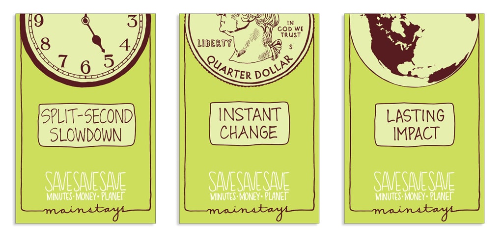
Walmart Mainstays Eco-Friendly Line & Poster Triptych
A related in-store poster campaign alerts Walmart shoppers that a Mainstays purchase is an easy and affordable way to contribute to responsible sustainability.
IDENTITY
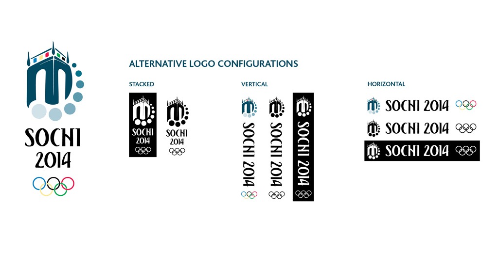
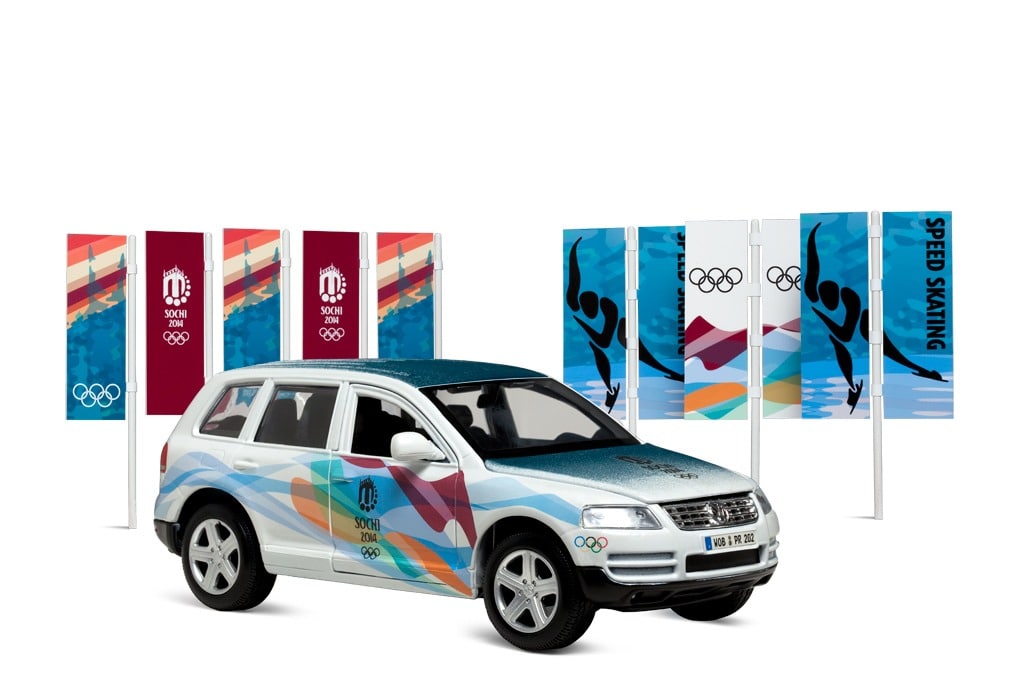
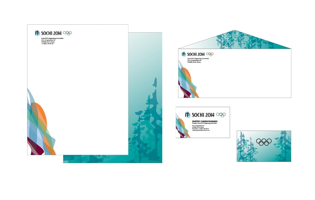
Sochi 2014 Winter Olympic Games Identity System
Logo design and variations, banner rhythms with sport pictograms, vehicle graphics, and stationery suite with business cards for the 2014 Winter Olympic Games in Sochi, Russia.
ILLUSTRATION & PUBLICATIONS
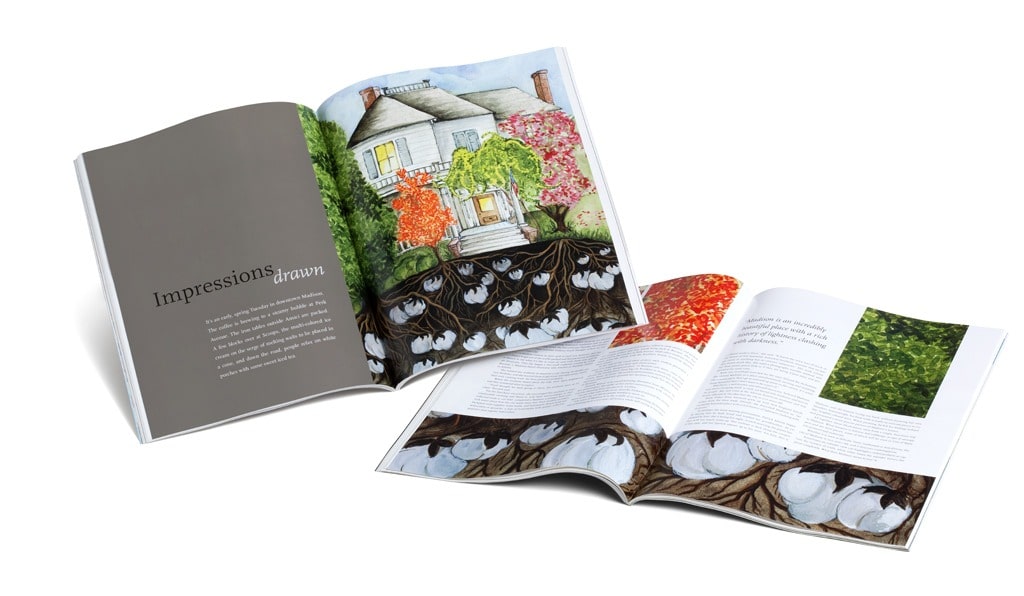
Madison, GA, Editorial Illustrations
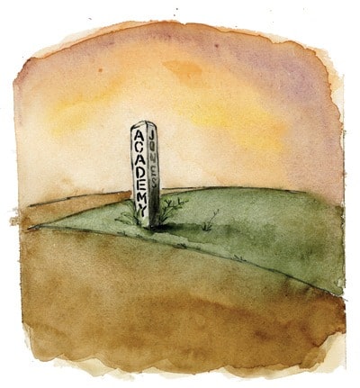
Madison, GA is one of the only towns spared by General Sherman and his Union troops on their drive to the ocean during the Civil War. Its main street is lined with gorgeous antebellum homes and beautiful heirloom flower gardens. But Madison’s past is still rooted in southern slavery, the darkness hidden just below the surface, across the tracks. Flora a house in Madison and its history inspired these illustrations and the accompanying publication.
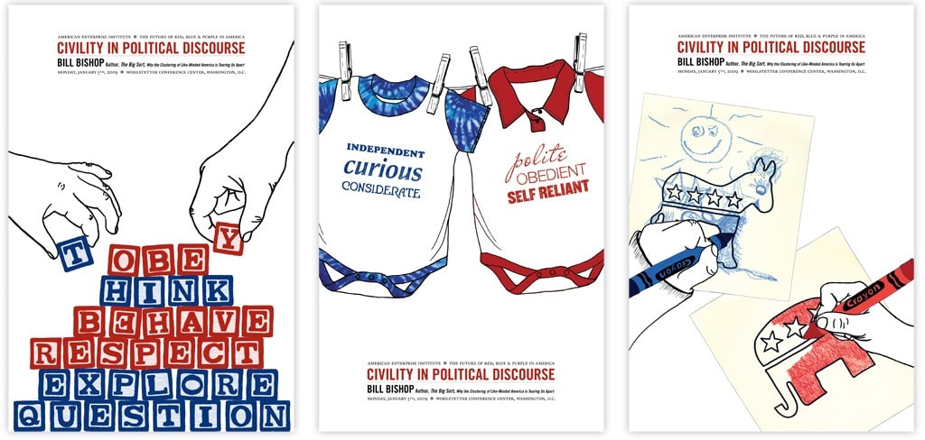
The Big Sort Lecture, Poster Design
One of the best books I’ve read is called The Big Sort: Why the Clustering of Like-Minded America is Tearing Us Apart by Bill Bishop. Bishop digs deep into politics, social stratification and individual needs to live and work with like-minded people…and shows how it’s created a vicious election cycle in the US. My poster series advertises an imaginary lecture whereby Bishop discusses Civility in Political Discourse.
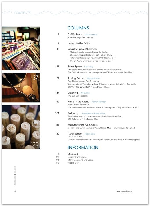
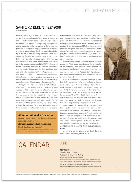
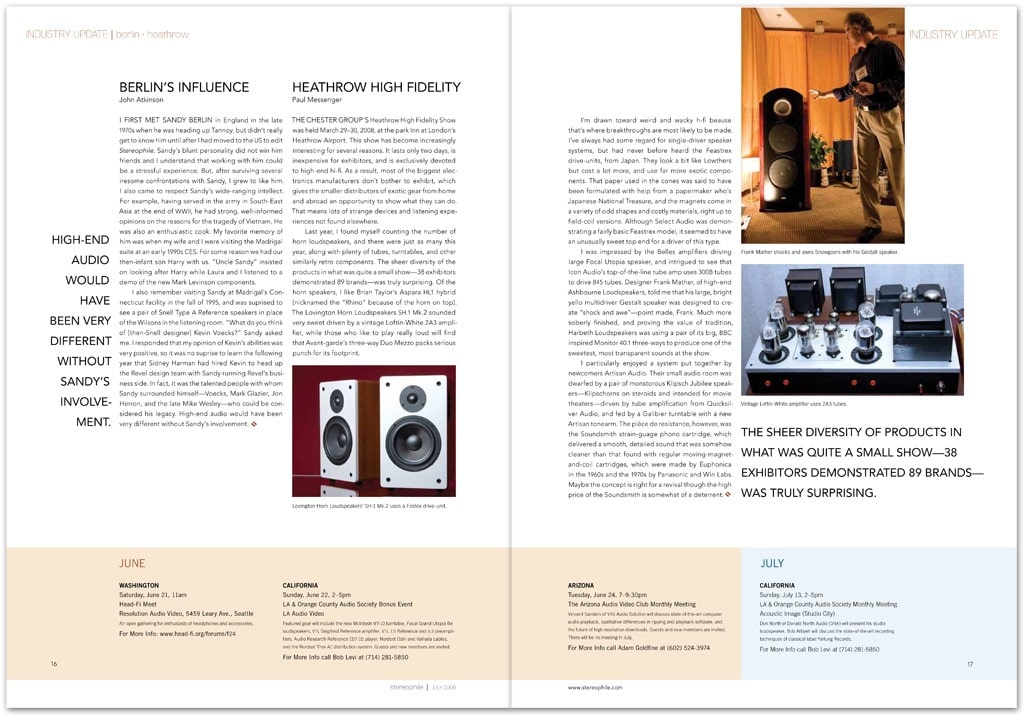
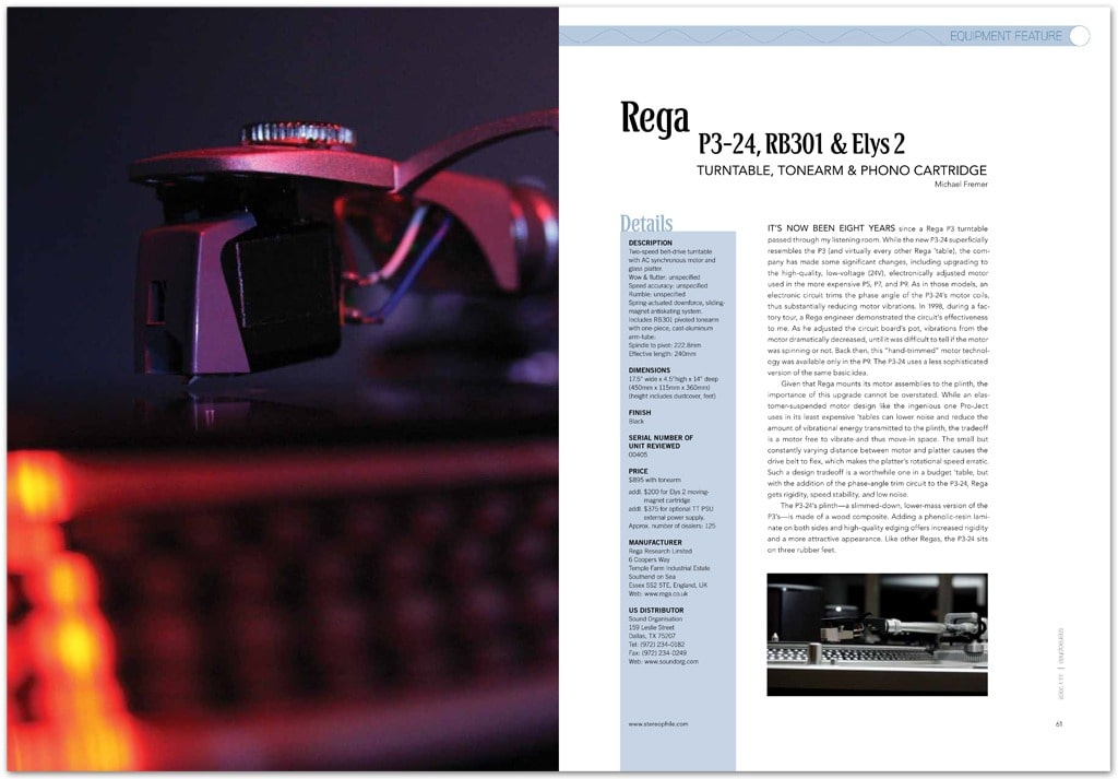
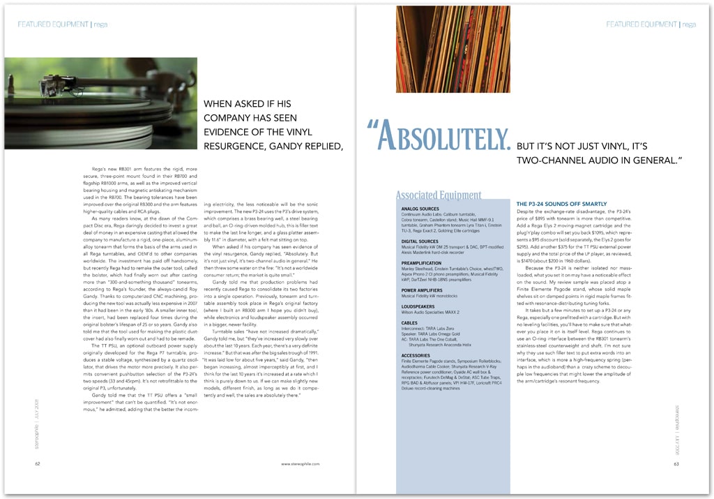
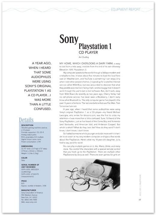
Stereophile, Publication Design
For my Type III class, we redesigned an entire magazine for audiophiles. The original magazine read much like an Auto Trader or a Want-advertiser, not a piece catering to the very top end of the audio listening population. I used type, image and layout to create a much classier feel.


